
I was a member of CanTeen; the Australian organisation supporting young people aged 12-25 living with cancer.
CanTeen Yearbook is a website providing CanTeen Sydney & Central Division members with an interactive online yearbook for celebrating and strengthening their support network.
By utilising social media to draw together their diverse conversations and memories from CanTeen Camps and Rec Days throughout the year, CanTeen Yearbook offers an accessible social hub for CanTeen members.
Holding a position in the Sydney and Central Division Committee at the time, I learnt that the committee wanted to produce a yearbook but did not have the necessary funds or time to carry out the project. In response to this problem, I decided to design an online yearbook – eradicating financial and environmental costs of printing and distribution with its simple access via the web.


CanTeen Yearbook’s colour scheme was inspired by CanTeen’s logo at the time (designed by Ken Done), with the array of colours appealing to both genders. The website’s aesthetic represents CanTeen’s young adult demographic and the joy experienced by its members on CanTeen events, appearing playful, youthful, colourful and bold.
My own hand-drawn illustrations enhance the website’s young and playful aesthetic, each meaningfully designed to suit its surrounding content and improve flow and connection between page sections. Animations on these images are triggered by a member’s scrolling action, entertaining and engaging members to view further content.

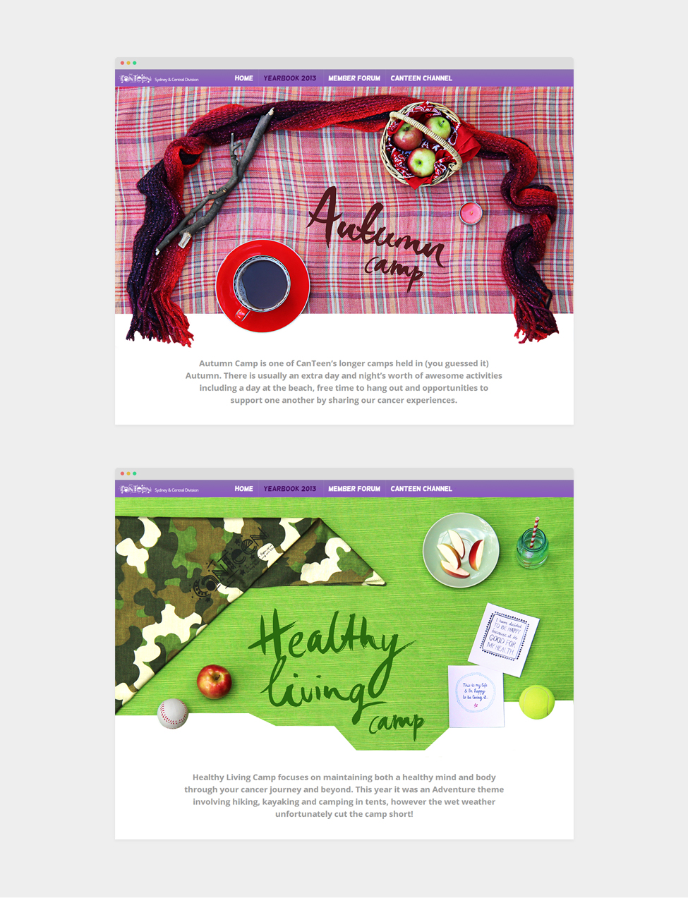
From the main Yearbook page, CanTeen members can read member summaries of the year’s Rec Days (which are short, one day programs) or click on the various Camp programs which involve more detailed summaries.
Each Camp page is accessed by the top navigation menu or in an image slider on the main Yearbook page. The menu displays a thumbnail of each Camp’s styled photograph next to its name and date. In the slider, each Camp includes a unique photo and pull-quote from a member summary.

The styled Yearbook photograph sums up the most valued and integral elements of a member’s CanTeen experience. These include words from CanTeen’s motto, “Support, Develop, Empower” and the iconic bandannas sold by CanTeen, which also represent cancer patients’ loss of hair during treatment.
In the Yearbook, a separate page is allocated to each Camp as they are longer programs involving a large number of members and activities. Styled photographs and hand-illustrated icons together playfully visualise the core meaning of each Camp.

The photographs have been styled with consideration of gender, age, consistent themes and core activities on each Camp. Every item was carefully planned, sourced and arranged on suitably coloured fabrics, leaving space in the centre to include each hand painted title. Certain items are cropped to create a visually engaging and dynamic appearance.
The loose, hand painted style used for each Camp title communicates the feeling of freedom that CanTeen provides to its members.
The CanTeen Channel is an extension of the Yearbook, and was initially planned as live social media feeds. After frequent liaising with the CanTeen Division Manager, I realised the live feeds were not feasible due to CanTeen’s concerns about security and moderation. Instead, the CanTeen Channel acts as a proposal for what could improve CanTeen members’ support network.
Each illustration represents the nature of its social media platform. Facebook’s ‘timeline’ resembles a chronological scrapbook of memories; Twitter’s fleeting nature of ‘tweets’ are like swift signals across a telephone wire; and Instagram’s emphasis on photo uploads with retro filters is a nostalgic reminder of the Polaroid.
